Redesigning Blunnies
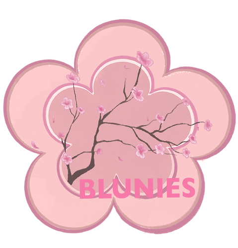
I redesigned Blunnies deodorant packaging with a focus on its Sakura ingredient. The original packaging was simple and lacked the personality needed to convey the product’s unique essence. My goal was to transform it into something that felt fresh, modern, and more reflective of the delicate beauty of Sakura.
I used floral elements and a soft color palette to create a design that blooms like a flower, capturing the essence of freshness and elegance. This redesign gives the product a more vibrant, attention-grabbing look while staying true to the natural inspiration behind the deodorant.
This project highlights my ability to elevate brand design by focusing on product identity and creating visually appealing packaging that resonates with consumers.


